
Cover Contest is over... so post Ur Covers!
- Thread starter StatiC
- Start date
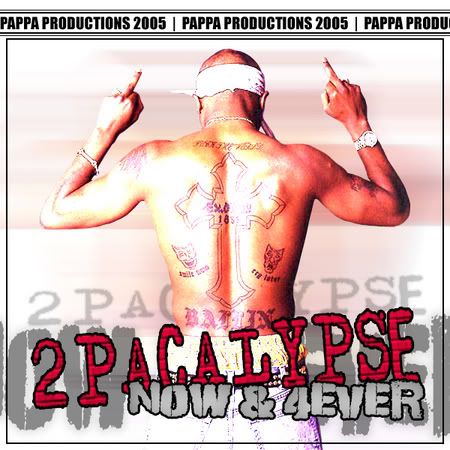

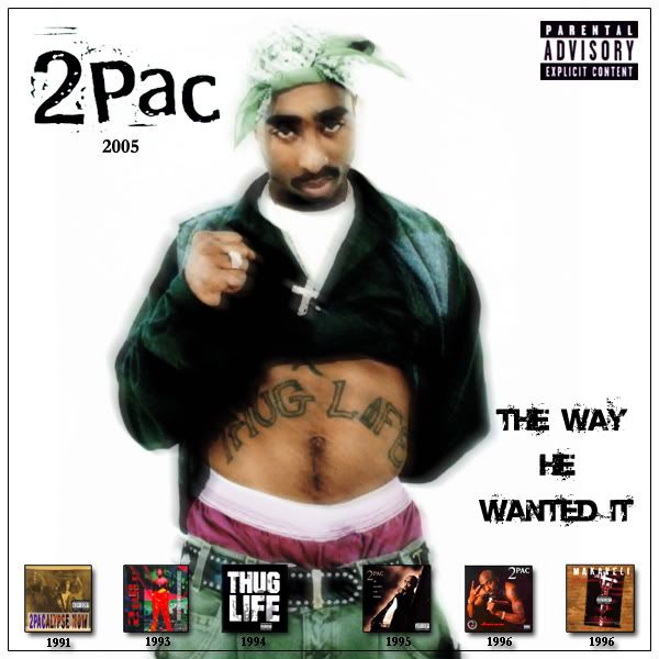
Here's mine, only heard about the contest litterally the day before so yeah, would have done more otherwise. Had a low quality pic to work with too, that i half redrew to give a more stylised look- really wanted to use this main pic as i think it perfectly sums up how pac would feel about the way his music is being handled  tried to make it a bit modern, not sure it fits but yeah.
mb.. really like the first cover, the concept it a bit old.. but you pulled it off very nicely. good job.

tried to make it a bit modern, not sure it fits but yeah.mb.. really like the first cover, the concept it a bit old.. but you pulled it off very nicely. good job.

dropdown said:
Here's mine, only heard about the contest litterally the day before so yeah, would have done more otherwise. Had a low quality pic to work with too, that i half redrew to give a more stylised look- really wanted to use this main pic as i think it perfectly sums up how pac would feel about the way his music is being handled tried to make it a bit modern, not sure it fits but yeah.
mb.. really like the first cover, the concept it a bit old.. but you pulled it off very nicely. good job.
tried to make it a bit modern, not sure it fits but yeah.mb.. really like the first cover, the concept it a bit old.. but you pulled it off very nicely. good job.
dropdown said:
Here's mine, only heard about the contest litterally the day before so yeah, would have done more otherwise. Had a low quality pic to work with too, that i half redrew to give a more stylised look- really wanted to use this main pic as i think it perfectly sums up how pac would feel about the way his music is being handled tried to make it a bit modern, not sure it fits but yeah.
mb.. really like the first cover, the concept it a bit old.. but you pulled it off very nicely. good job.
tried to make it a bit modern, not sure it fits but yeah.mb.. really like the first cover, the concept it a bit old.. but you pulled it off very nicely. good job.
wow man, good job it looks sweet


dropdown said:
Here's mine, only heard about the contest litterally the day before so yeah, would have done more otherwise. Had a low quality pic to work with too, that i half redrew to give a more stylised look- really wanted to use this main pic as i think it perfectly sums up how pac would feel about the way his music is being handled tried to make it a bit modern, not sure it fits but yeah.
mb.. really like the first cover, the concept it a bit old.. but you pulled it off very nicely. good job.
tried to make it a bit modern, not sure it fits but yeah.mb.. really like the first cover, the concept it a bit old.. but you pulled it off very nicely. good job.


dropdown said:
Here's mine, only heard about the contest litterally the day before so yeah, would have done more otherwise. Had a low quality pic to work with too, that i half redrew to give a more stylised look- really wanted to use this main pic as i think it perfectly sums up how pac would feel about the way his music is being handled tried to make it a bit modern, not sure it fits but yeah.
mb.. really like the first cover, the concept it a bit old.. but you pulled it off very nicely. good job.
tried to make it a bit modern, not sure it fits but yeah.mb.. really like the first cover, the concept it a bit old.. but you pulled it off very nicely. good job.
LBurna8484 said:
Using the 1st cover and with acouple things used from the 2nd and 3rd cover I give you...


nick, makaveli_7, Pain of depth; thanks for the good feedback, apreciated.
StatiC: yeah it was hard to judge exactly where the body was and ended up a lil rushed so posture is pretty much guess work, here is the exact image i had to go off.. a low quality, dark image of another image so that didnt help either :thumb:
http://img137.echo.cx/img137/340/2122pac7dtposter8lv.jpg
dropdown said:
Here's mine, only heard about the contest litterally the day before so yeah, would have done more otherwise. Had a low quality pic to work with too, that i half redrew to give a more stylised look- really wanted to use this main pic as i think it perfectly sums up how pac would feel about the way his music is being handled tried to make it a bit modern, not sure it fits but yeah.
mb.. really like the first cover, the concept it a bit old.. but you pulled it off very nicely. good job.
tried to make it a bit modern, not sure it fits but yeah.mb.. really like the first cover, the concept it a bit old.. but you pulled it off very nicely. good job.
but youre cover is really great, best ive seen so far :thumb:
(that edited one looks even better, only the parental advisory is missplaced imo)
here is one i did a very long time ago. judging by the other covers im pretty sure we are to have "the way he wanted it" put on the cover somwhere. i think the one i made is good especially for me who has no photoshop skills whatsoever.
mine just says "Tupac: OG". i put that title as a double meaning. OG for original material. and OG for orignal gangsta.

if u cant use it at all then thats fine i just wanted people to see it
mine just says "Tupac: OG". i put that title as a double meaning. OG for original material. and OG for orignal gangsta.
if u cant use it at all then thats fine i just wanted people to see it
so i guess this is the winning cover: http://www.themixtapes.net/pac.htm
RIP Makaveli said:
so i guess this is the winning cover: http://www.themixtapes.net/pac.htm


dropdown said:
Here's mine, only heard about the contest litterally the day before so yeah, would have done more otherwise. Had a low quality pic to work with too, that i half redrew to give a more stylised look- really wanted to use this main pic as i think it perfectly sums up how pac would feel about the way his music is being handled tried to make it a bit modern, not sure it fits but yeah.
mb.. really like the first cover, the concept it a bit old.. but you pulled it off very nicely. good job.
tried to make it a bit modern, not sure it fits but yeah.mb.. really like the first cover, the concept it a bit old.. but you pulled it off very nicely. good job.
you got mad skills :thumb:Donate
Any donations will be used to help pay for the site costs, and anything donated above will be donated to C-Dub's son on behalf of this community.